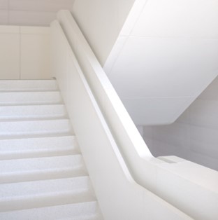
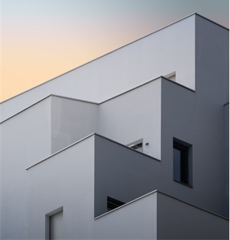
There is plenty to say about personal preference when it comes to appreciating art of any kind. However, there is no doubt that architecture can sometimes complicate the issue with questions of functionality as well as beauty. With that interesting dichotomy in mind, David DeQuattro examines minimalism in architecture: embracing simplicity and elegance.
According to the industry experts, there is an inherent beauty in architecture’s simplest designs, usually seen in minimalism. Architects who deliberately choose to keep their designs simple maintain an elegance without losing the philosophical and practical benefits of their architectural works.
Below is a deep dive into minimalistic architecture and the beauty behind it. Particularly, buildings in a commercial space, and why minimalistic designs have become so popular in this context.
Embracing Simplicity and Elegance
Minimalism began as a practical offshoot of Cubism in art. This naturally extended into the realm of architecture. The most important principle is “less is more,” which entails getting rid of elements in a design that are not necessary.
Functionality Creating Elegance
The point of any building is not purely aesthetic; it must function as a shelter, but also has an impact on those who will be using it, psychologically. Therefore, the functionality of a building should be married to a clarity of design. This looks like simpler structures with clean lines that reflect the overall goal of the building’s construction.
Popularity in Commercial Building Designs
Let’s look at what makes minimalism popular, specifically in commercial spaces.
Relaxed Atmosphere
The atmosphere of a building in a commercial space is incredibly important. Clients and workers alike should be able to come in frequently and actually enjoy their time around and inside the building.
A building designed with minimalistic elements, especially in the interior, helps this along. There are often open spaces, psychologically lessening stress that might be induced through a sense of clutter. Precise shapes and a sense of “breathing room” are often associated with comfort, the same way an open field might affect a person standing in it.
Economic Improvements
A minimalistic building that has no fancy, unnecessary ornaments or décor, as well as fewer changes in materials in general, becomes less expensive to build.
It is also less expensive to maintain. What this means is that the building no longer represents a drain on resources and the benefits of the design can be enjoyed more freely.

Higher Quality Work
Finally, the smaller variation in components used for a minimalistic design is usually a sign of work that is more excellent in quality. Builders can re-assign their funds to the highest caliber materials, for example.
Conclusion
In summary, the benefits of minimalism in architecture, specifically in commercial building designs, shines a light on this approach to design that allows us to easily embrace simplicity and elegance.
Minimalism emphasizes the idea of less being more for a variety of reasons. For example, in a building that is smaller than many commercial design choices, there is more time and money saved for higher quality. In addition, fewer elements and components of design can contribute to an overall relaxation of atmosphere for consumers and workers who use the building itself.
Finally, the cutting of costs is a practical addition to the beauty that minimalistic-designed examples of architecture provide. Not only are the components of the building less expensive, but maintenance on a smaller, less complex building is cheaper, too. This frees us up to appreciate the soft color palettes, simple symmetry, and other elegant elements.

